UsabilityLab conducted a study of iOS banking apps. The specialists conducted the test based on 14 user scenarios. Some of the key points of the study were authorization and sending a code when entering the application, transferring to another bank card, as well as searching and viewing card transactions.

The experts also evaluated the convenience of complex operations, such as replenishing the Troika travel card and paying traffic police fines.
The test took into account the completeness of information provided to the user, the relevance of functions required to perform the selected tasks, the usability of the interface and the criticality of usability issues.
UsabilityLab chose Sberbank Online as the most convenient application: it showed the least problems. According to experts, Sberbank application is the best by the set of functions, which are viewing the history of transactions and getting the financial analysis. The second line was taken by the application of Tinkoff Bank, and the third - by VTB.
Below we give the final ranking of applications:
- Sberbank;
- Tinkoff Bank
- VTB
- Raiffeisenbank
- Promsvyazbank
- Alfa Bank;
- Rosbank
- Russian Standard Bank
- Rosselkhozbank
- Otkritie Bank;
- Bank Saint-Petersburg;
- Gazprombank
- UniCredit Bank
- Home Credit Bank
The Freesoft editors asked the participants of the survey what, in their opinion, they lacked to win and how their applications will be improved in the future.
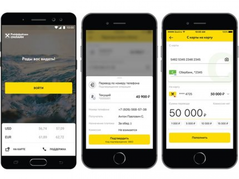
Anna Surovykh, leading product manager of Raiffeisenbank e-business development department (4th place):

- Mobile application development is a very interesting and multifaceted area, one of the indicators of the effectiveness of which is customer satisfaction, and of course, a place in the ratings conducted by analytical agencies. The qualitative breakthrough that we made in the past year, which allowed us to be in the top five, is very important to us.
We put a lot of effort to achieve this result, and it's great to see that we are moving in the right direction. The basis for all the changes we are making is the process of building and studying the customer experience, defining real needs, testing hypotheses and further implementation. A good product is built around solving customer needs, so the basis for all the changes we are making is the process of building and studying the customer experience, defining real needs, testing hypotheses and further implementation.
We are becoming a digital office for clients, constantly expanding the range of products and services available from the mobile app, which is also reflected in the latest rating from UsabilityLab. Over the past year, we've implemented a large number of changes to the app's services. For example, all transactions related to account transfers are now instantaneous. Many components of our system have been improved for this purpose. The microservice architecture and the modular approach in the implementation of new functions are increasingly being implemented, which allows us to make any improvements independently of the rest of the application promptly. Also, Raiffeisen Online has launched a full-fledged platform for the opening of new products and our users can now apply for a loan from anywhere in the world. To support our customers more quickly, we introduced a chat with the bank's operator in the application, where you can not only get quick advice on matters of interest, but also, for example, ask to send an insurance policy. In total, during the year that passed since the publication of the last report, we implemented about 50 new features, each of which was developed based on an in-depth analysis of the wishes and needs of our clients. A quick payment system, chat, an online product storefront, fines and charges search, transfers via Bluetooth and Siri are a small part of what's been done.
To become the best mobile bank on the Russian market, it is not enough yet, but we know the problems, the solution of which will help us to take the leading position in the future. First of all, we want to improve a lot of what is already implemented in our application. This includes a large number of user experience improvements that the product design team is working on, improvements to our backend systems, and a huge number of features that should help customers manage their finances more easily and conveniently. We are already developing a new platform to keep track of client spending and history of transactions. We plan to make such a service, which can meet the requirements of the most demanding clients, and will also be well scalable, because we expect that in the nearest future there will be more and more possibilities in this direction. We will also improve a lot in our architecture, which will make it possible to save the cards, to which or from which transfers were made through the application for conducting faster operations in the future. The search system for fines and charges will be completely redesigned, which will get rid of cases where the state information system does not give a prompt answer, and this is a very frequent case now. Already we have a lot of ideas for the implementation of deeplinks and we are actively working to implement them. We realized that many people do not know that our bank has one of the most extensive discount programs for customers, so we are already working on their implementation in Raiffeisen Online.
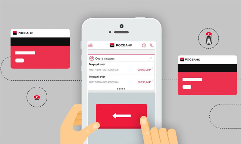
Alex Lola, director of digital retail business at Rosbank (7th place):

- We consider our position in the rating very positive: on the one hand, it is a good result, which is adequate to our efforts (we moved up to 4 positions) and consistent with our strategic plans. On the other hand, it is a good motivator for the bank's team, which points us to further points of growth and opens a lot of room for development - and we really like complex and interesting challenges.
How will we improve our position in the future? In several parallel ways. We believe that a positive user experience (UX) is shaped not only by interfaces and their usability, but also by the stability, responsiveness and functionality of the technology platform as a whole. This is why we are now focusing not only on improving and revising the UI component, but also on a deep reworking of backend systems and their principles of interaction with the mobile application in accordance with modern technologies and requirements, and our teams are transferring to the format of so-called T-shaped competencies, when each employee is not just an expert in his field, but can also understand what his colleague from a seemingly completely different field is doing. And we are deeply convinced that the future belongs to such multidisciplinary teams.
Modernization is going on on all fronts, we have big plans - and next year we are counting on further growth in the ratings.

 Русский


